The Ultimate Website Template for Your Business
Published: Apr 19, 2024
Creating your website is a huge step in launching your business.
But most of us aren’t web designers. Getting a good website up and running can feel daunting!
There are so many things to consider. Your website should engage visitors, have great SEO, and drive sales for your business.
Most people think you need to spend thousands of dollars or countless hours to create a high performing website. But it's really much simpler than that.
You just need a website template to help you make small tweaks that can lead to big increases in your leads and sales numbers.
A good website template can answer questions like:
- What words should I put on my website?
- How should I layout my website?
- How do I ensure my website has good SEO?
Let’s take a look at 3 elements of a fail-proof website template that works for businesses in any industry. If you want to download the full template with all 7 elements more detailed instructions, click here!
1. The Hero Section: Clear is Best
The first part of a great website is the “hero” section. It's the top portion of your home page and the first thing people see when they visit your website.
Many businesses get this section wrong. How? They try to be cute and clever instead of clear. But your visitors don’t have time to interpret a cute or clever message. They want to know within seconds if you have what they’re looking for. According to HubSpot, the average time spent on a website is 54 seconds.
That’s why our website template recommends answering these 3 questions in the hero section:
- What do you offer?
- How will it make your customer’s life better?
- What do people need to do to buy your product?
Here’s an example from Skinworx who follows this website template in their hero section:
This website header tells the audience exactly what is being offered (ageless beauty), how it will make their life better (radiate confidence), and what the visitor needs to do in order to get it (shop now).
This brings us to another key element of your website template: the call to action.
2. The CTA Button: Guiding Visitors to Take Action
Your call to action (CTA) button is like your website’s cash register. How important is it to have a cash register in a store? Well, if your goal is to sell products and make money, it’s extremely important!
But many businesses get this part of their website wrong as well. Instead of confidently calling customers to action, many businesses are passive and vague – or even worse, they never call the visitor to take action at all. This is why we recommend having a clear and direct call to action in multiple places in our website template.
Think of it like this: If a user lands on your site and wants to purchase your product or service, what is the next step you want them to take?
Can they buy your product now? Do they need to schedule a call with you? Do they need to set up an appointment?
Your CTA button should reflect that exact action. Why? Because calls to action like “Learn more,” “Our Story,” or “About Us” are weak and confusing.
What a customer really needs is something to accept or reject. Until then, they will be confused about what you want them to do or where you want the relationship to go.
The best CTAs are short and direct:
- Buy Now
- Register Now
- Join Now
- Schedule a Call
- Book an Appointment
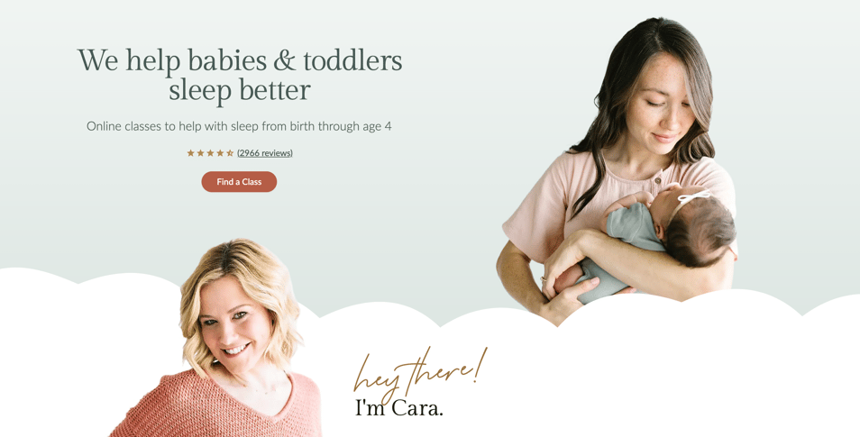
I love this example from Taking Cara Babies. There's no mystery about what they offer (sleep training for babies) and the first step I need to take to get it (Find a Class).

The placement and repetition of the CTA button is also important. The truth is, customers need to be called to action multiple times. There should be zero confusion about what you want them to do.
We recommend placing the CTA button…
- In the hero section of your website
- At the top right of your website in the menu bar
- In each section as visitors scroll down your page
Calling the customer to action multiple times is one of the secrets of a great website layout.
But what makes a user want to buy from you and click that CTA button? That brings us to another crucial part of the website template – the “Guide” section.
3. Setting Yourself Up as the Guide: Empathy and Authority
In order to earn trust and inspire visitors to take action, you want to position yourself as the trusted Guide who can help.
How do you do that? By demonstrating both empathy and authority.
You want to empathize with the pain your customer is experiencing. When you do this, it lets your customer know that you understand the problem they’re facing – and this builds trust. After all, how can you solve a problem if you aren’t aware of it or don’t understand it?
When your visitor reads words on your website that articulate their pain, they engage. They get curious. They begin to trust you.
But empathy isn’t the only thing it takes to earn trust.
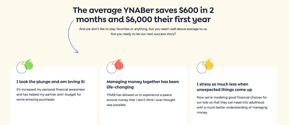
You must also demonstrate your competence to help them overcome their problem. You can do this by displaying testimonials, stats about the number of people you’ve served or products you’ve sold, awards you’ve received, certifications you hold, etc.
Look at how You Need a Budget demonstrates both empathy and authority on their website.

When you show that you understand the problem at hand and have the authority to solve it, visitors will be much more likely to do business with you.
A Website Template That Works
You don’t have to guess at what works when it comes to creating your business website. These are just 3 of many sections outlined in our free resource: The Ultimate Website Template: How to Create an Impressive Business Website That Generates Leads and Drives Sales.
We’ve helped thousands of companies (including TREK Bicycles, TOMS Shoes, and Berkshire Hathaway) create a website using this marketing framework. It will work for you, too!
Download it free now:

